
Do you know how long it takes for someone to decide whether they’ll keep reading your email?
Probably less time than it took you to read this sentence.
According to a study, you only have 10–15 seconds to grab your reader’s attention. And the design of your email plays a huge role in whether someone keeps reading or swipes to the next one.
This article will discuss how to design email campaigns that capture your readers’ attention quickly and keep them engaged to read further.
What do you mean by email campaign design principles?
Email campaign design principles are the best practices that guide how your emails are structured and formatted so they are easy to read, visually appealing, and effective across all devices and inboxes. Good design ensures your emails load quickly, look professional, and naturally lead readers toward the action you want them to take, whether that’s clicking a link, signing up, or making a purchase.Using the right email marketing software can help you apply these principles consistently without extra effort.
5 key elements of email design
When you’re setting up an email campaign, the very first thing you want to do is focus on email design and craft each email carefully. To help you nail this, here are five essential components you need to focus on for every email you create:
Email layout
Your email layout organizes text, images, and buttons in a clear structure so readers can easily scan it. Typically, email layouts fall into three groups:
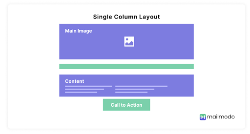
- Single-column layout: This layout stacks all content blocks vertically in a single, full-width column. It’s ideal for mobiles, as the design is simple and there is a clear hierarchy of information from top to bottom.
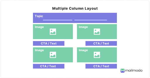
Multi-column layout: Here, you display content side-by-side in two or more columns. This works great when you want to showcase several pieces of content or information at once, like product features, blog posts, or product comparisons. It’s ideal for screens that are landscape.
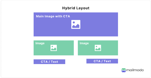
Hybrid layout: This layout combines both layouts. It has sections following the single-column layout and may have a section with a multi-column layout beneath it. It’s a go-to for newsletters and promotional campaigns where you want to highlight one key message before branching into secondary content.
Regardless of the layout you choose, the key is to keep the design simple and mobile‑friendly. A clean, uncluttered structure prevents overwhelming the reader with too much information at once and makes it easier for them to focus on the most important message or call to action.
Typography
Typography is the styling of written content and it includes the typeface, weight, size, color, and letter spacing. These choices work together to establish hierarchy, convey important information, and ensure your message is both attractive and flows easily.
Let’s take a look at each element in depth:
- Typeface: This refers to the font family, such as serif, sans serif, script, monospaced, or display, and defines the overall look of the characters. Within each typeface family, there are multiple fonts. For email design, it’s important to use email-safe fonts like Arial, Helvetica, which are supported by most email clients like Gmail, Outlook, and Apple Mail, unlike web-safe fonts that are pre-installed on operating systems.
- Weight: Weight refers to the thickness of the characters. Using different font weights helps emphasize headlines or key points while keeping body text lighter and easier on the eyes.
- Size: Font size refers to the height of the letters. Font size controls readability and guides the reader’s eye through the content. Headings should be larger (20px to 36px) to stand out, while body text should be between 14px and 18px for comfortable reading on both desktop and mobile screens. A font size that is too big or too small makes the overall reading experience uncomfortable.
- Spacing: This includes both letter spacing (the space between individual characters) and line spacing (the vertical space between two lines of text). Proper spacing helps prevent the email from feeling cramped and improves overall legibility.
- Color: Color influences tone and emotional impact while also affecting readability. Ensure there is enough contrast between the text and the background to make your message easy to read. A low contrast ratio can make your text difficult to read.
Imagery
Images immediately grab readers’ attention and support text content. But for them to work properly across all email clients, they need to be optimized carefully.
Large or poorly compressed images can slow down email load times and may not display correctly on all devices,s while unclear images can leave a poor impression on your recipients. You must also consider accessibility of these images by adding descriptive alt text, so recipients using screen readers or those with images turned off still understand the message. Here are some other things to focus on when dealing with images in emails.
- Image types: Use PNG or JPEG for static images as they provide good quality with manageable file sizes. For animations, GIFs are popular but should be used sparingly to avoid distracting or overwhelming the reader.
- Size: Keep image files under 1MB to maintain fast loading speeds, especially on mobile networks.
- Placement: Position images strategically to complement the text. Hero images at the top can create a strong visual impact and act as a hook to engage readers, while smaller icons or graphics can break up chunks of text to relieve the eyes and illustrate points better.
Buttons
Buttons are key interactive elements in your email design that guide readers toward the desired next step. This can be something like making a purchase, signing up, or visiting a webpage.
Here are some best practices to maximize the effectiveness of your buttons:
- Placement and visibility: Position your primary call-to-action (CTA) button where it’s immediately visible, ideally within the first fold, so readers don’t have to scroll to find it. Also, avoid cluttering your email with too many buttons.
- Design and size: Make sure buttons are large enough to be tapped easily on mobile devices (generally at least 42px in height). Use contrasting colors that stand out against the background but still align with your brand’s color palette. Tip: Rounded corners tend to feel more clickable and friendly.
- Clear, action-oriented text: Use concise, benefit-focused text like “Shop Now,” “Get Started,” or “Download Free Guide” that tells the recipients about the action that’s going to happen. Avoid vague phrases such as “Click Here.”
- Secondary buttons: If you include secondary CTAs, style them in a way so they aren’t dominating the primary CTAs visually. To do this, use lighter colors, smaller sizes, or have only the outlines of the buttons..
- Bulletproof buttons: Consider using HTML/CSS-based “bulletproof buttons” rather than image-based buttons. They load faster, render better across email clients, and adapt well to different screen sizes.
Color
The colors you choose influence how your message is perceived and can significantly impact engagement. A good starting place when selecting colors for your email is your brand palette. These are colours your customers are already familiar with and people associate your brand with. It is easy to maintain consistency.
Here is how the colors affect your email:
- Emotional impact: Different colors trigger different feelings. For example, blue can build trust, red creates urgency, and green signals growth or success. Choose colors that match the goal of your campaign.
- Highlighting CTAs: Use bright, contrasting colors for your call-to-action buttons to make them stand out and encourage clicks. Make sure these colors complement your overall palette but still draw immediate attention.
- Seasonal themes: Adjust your colors for seasonal campaigns—for example, red and green for the holidays, or pastels for spring. It makes your emails feel timely and relevant.
5 email campaign design principles
Here are 5 email campaign design principles to make your emails look visually stunning and consistent.
Stick to a layout
Use the same structure throughout the campaign. For example, if you start with a single-column layout in Email #1, don’t suddenly switch to a zig-zag layout in Email #2.
A good approach is to choose one or two reusable email templates and save them in your email builder. That way, you can just pick up one of them and edit it and build your new email on top of it. It cuts down the time consumption heavily.
Use a consistent color palette and font
Reference your brand color palette and fonts every time you create an email. Your audience should be able to recognize at a glance that the email is from your brand. To make this easier, set up your brand colors and fonts as default styles in your email builder.
Also, avoid experimenting with extra colors mid-campaign, even for emphasis, because this can break the cohesiveness of your emails.
Use coordinated CTAs
Each email might highlight different benefits or address different objections, but your CTAs should stack one upon another and feel like a natural next step.
For example, your first CTA might lead to a blog post, the second to a product page, and the final one to a checkout or demo request. Keep them aligned with your overall campaign goal, and always guide your readers forward.
Maintain consistency in images
Choosing a consistent image style is key to building brand recognition in your emails. Whether you use illustrations, infographics, photography, or a playful comic style, pick one visual approach and stick to it throughout your campaign. This consistency makes your emails feel cohesive and instantly recognizable.
For example, if your website uses minimal, clean product photography, your emails should carry the same look. A unified visual style across all channels strengthens your brand identity and creates a seamless experience for your subscribers.
Have a proper hierarchy
Structuring your email content with clear headings and subheadings helps readers follow along effortlessly. Mark your main topics as H2s and use H3s for related subtopics underneath.
This hierarchy not only improves readability but also makes your emails easier to scan. Readers can quickly grasp the key points and take action without feeling overwhelmed.
How to ensure good email campaign design
The easiest way to ensure good design in all your email campaigns is to use email templates. This also ensures consistency in the overall design of the emails sent as part of one campaign. It also allows you to stay true to your brand guidelines.
You can pre-build email templates for different use cases and have them ready, thereby slashing your overall email creation time too.
Platforms like Mailmodo make email design effortless with an intuitive no-code builder and a library of ready-to-use email templates. You can easily customize templates or create emails from scratch in minutes, with full control over every design element.
Final thoughts
The practical tips mentioned above in this guide will help you easily capture readers’ attention and make them more inclined to click and convert. Whether you’re using any email campaign service or just getting started with email marketing, these strategies apply.
As you plan your next campaign, take a moment to look at your current emails. Are the layouts clear? Do the visuals and tone feel like they belong to the same brand? Are your CTAs working together across the series?
Even small tweaks like simplifying your layout, tightening up your copy, or using brand colors more consistently can make a big difference.
